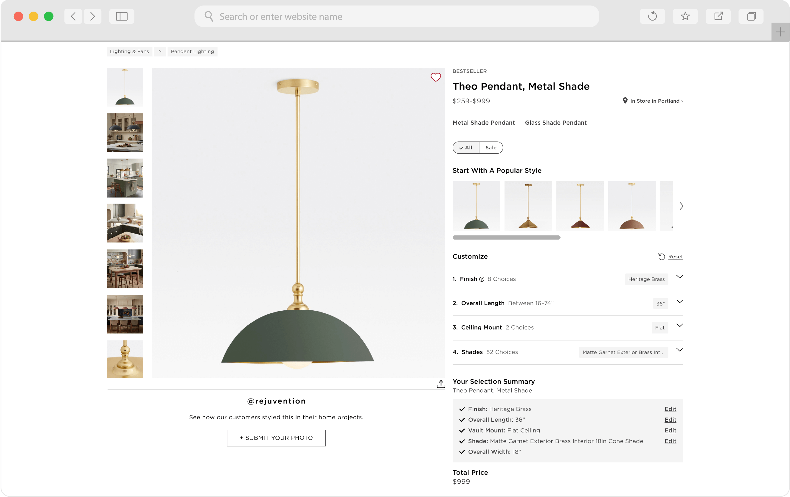
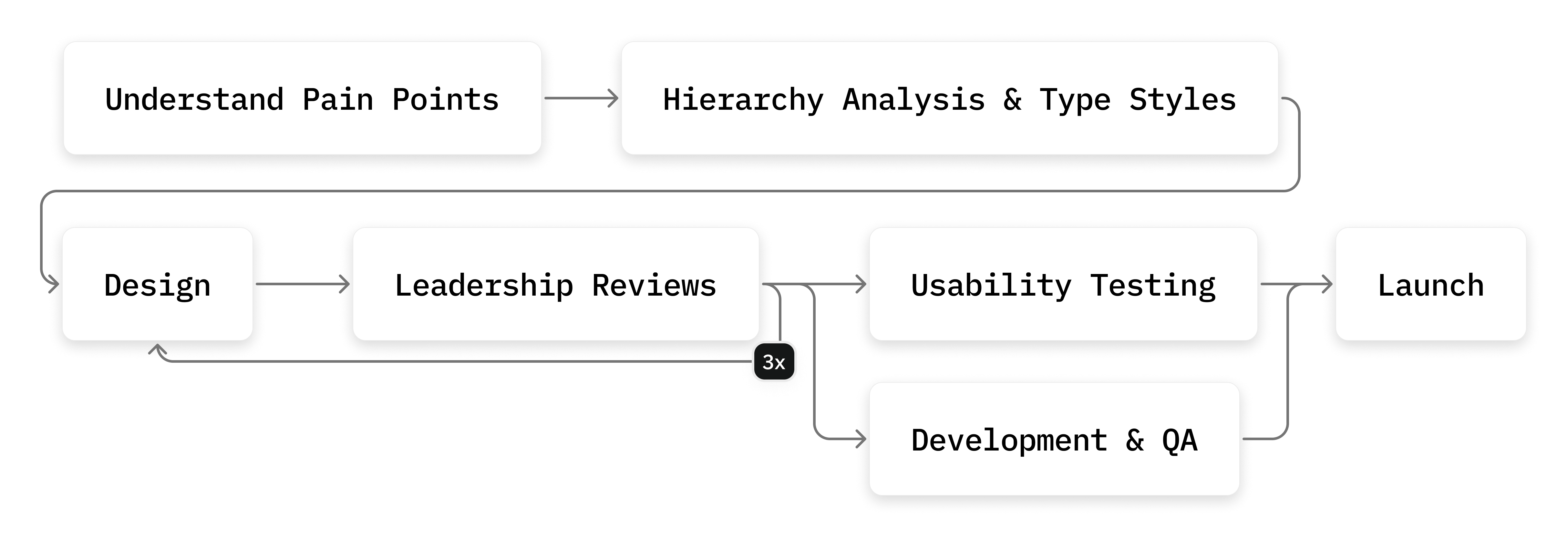
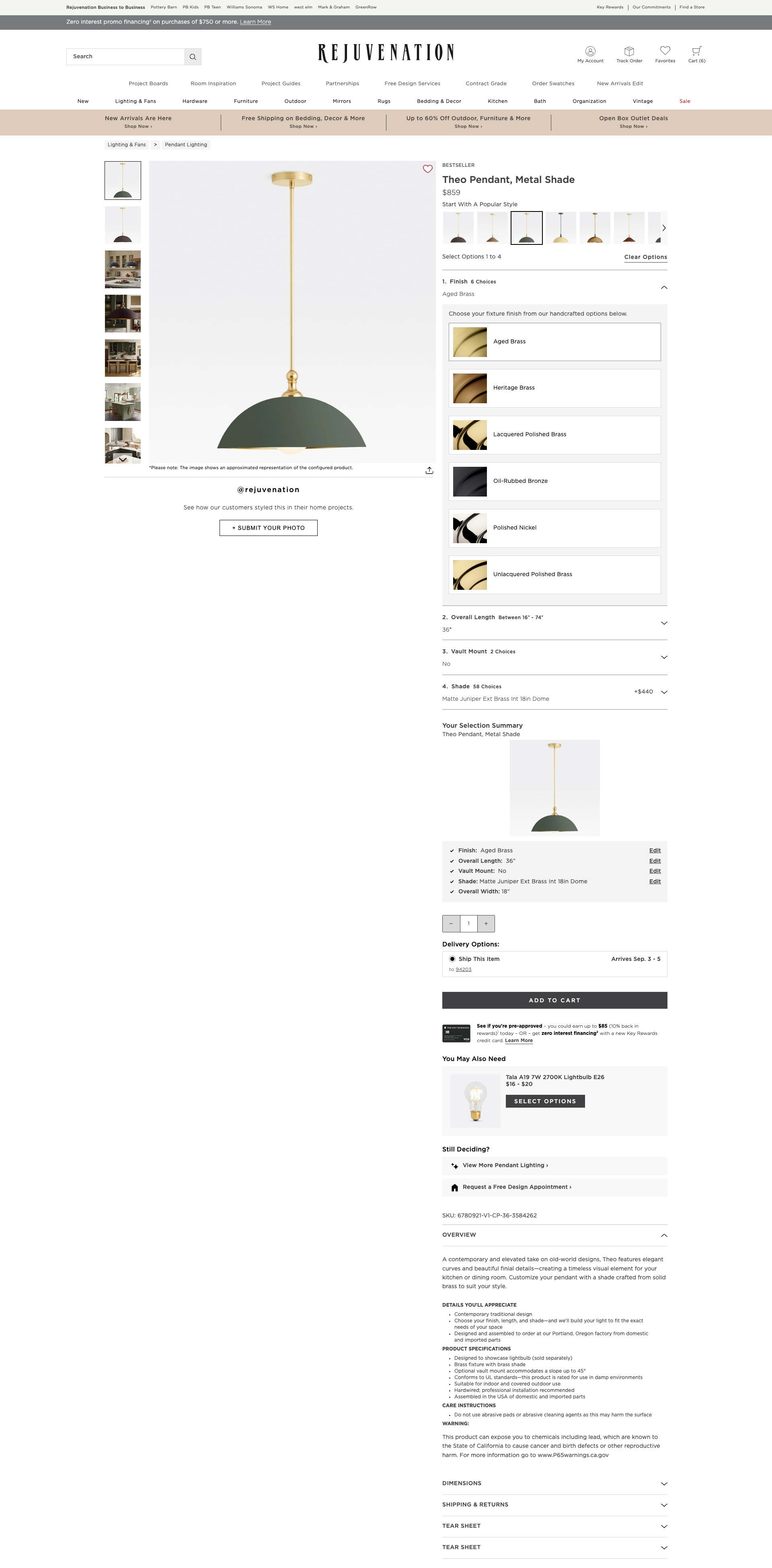
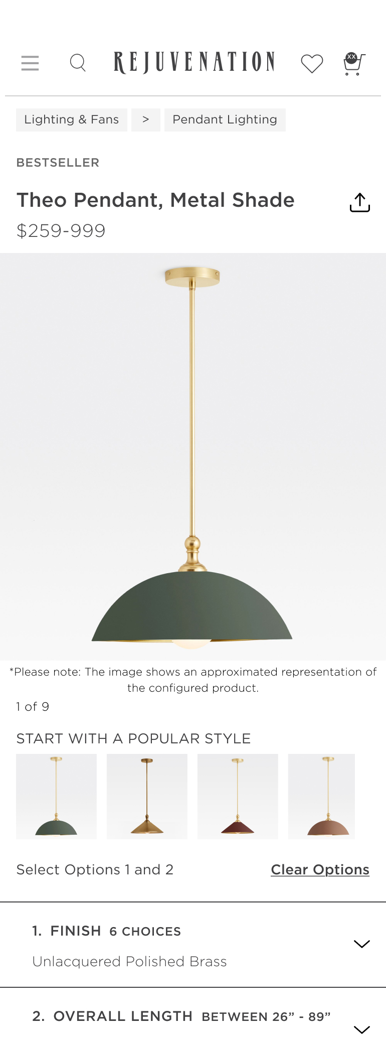
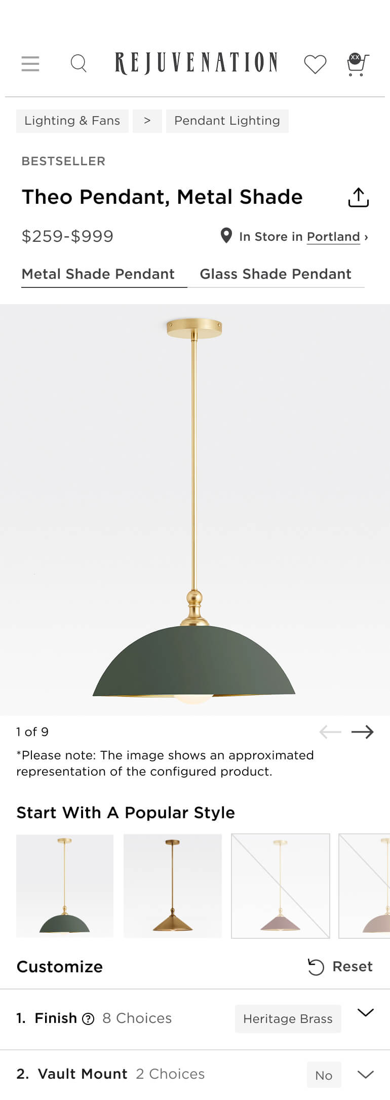
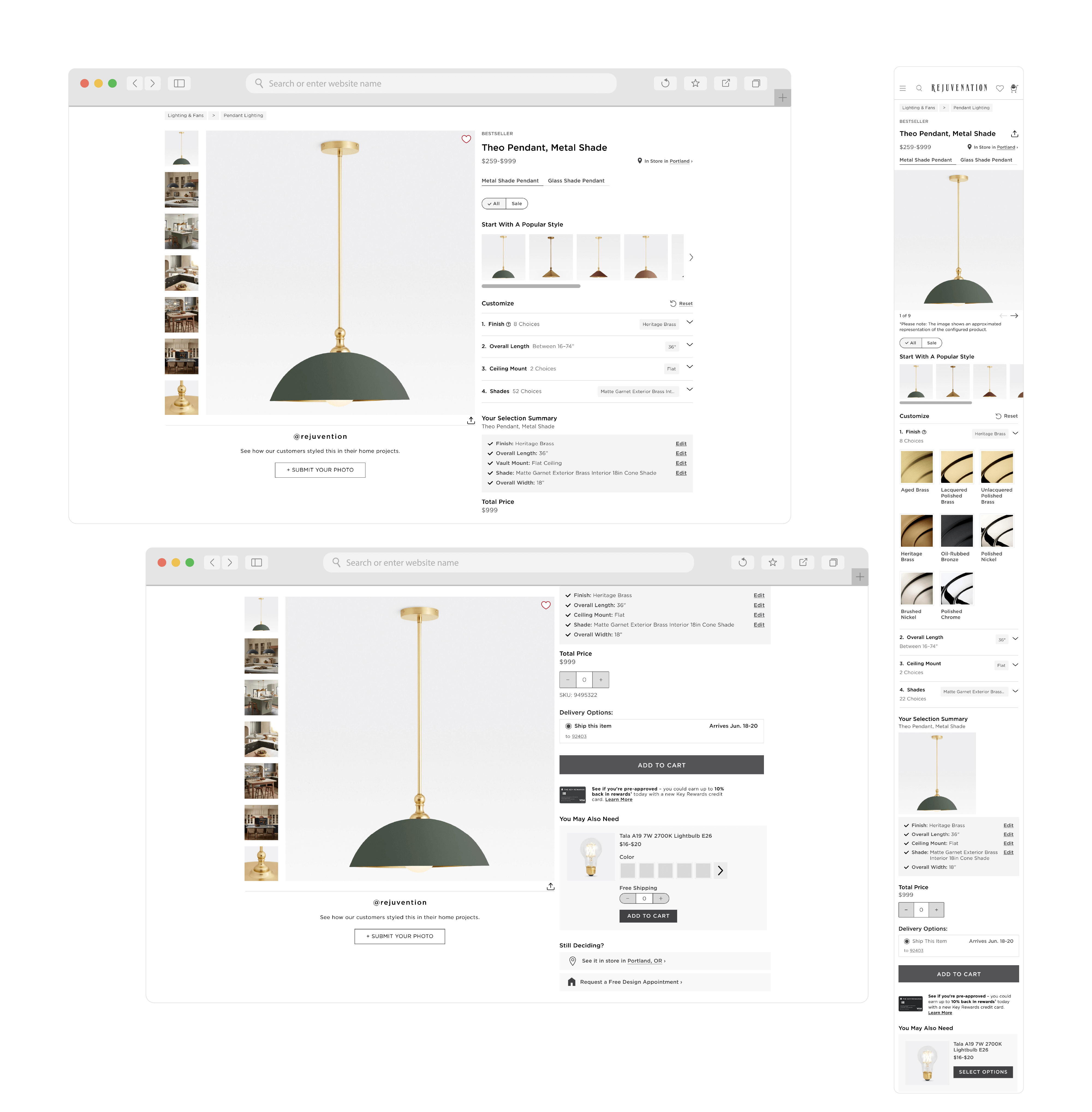
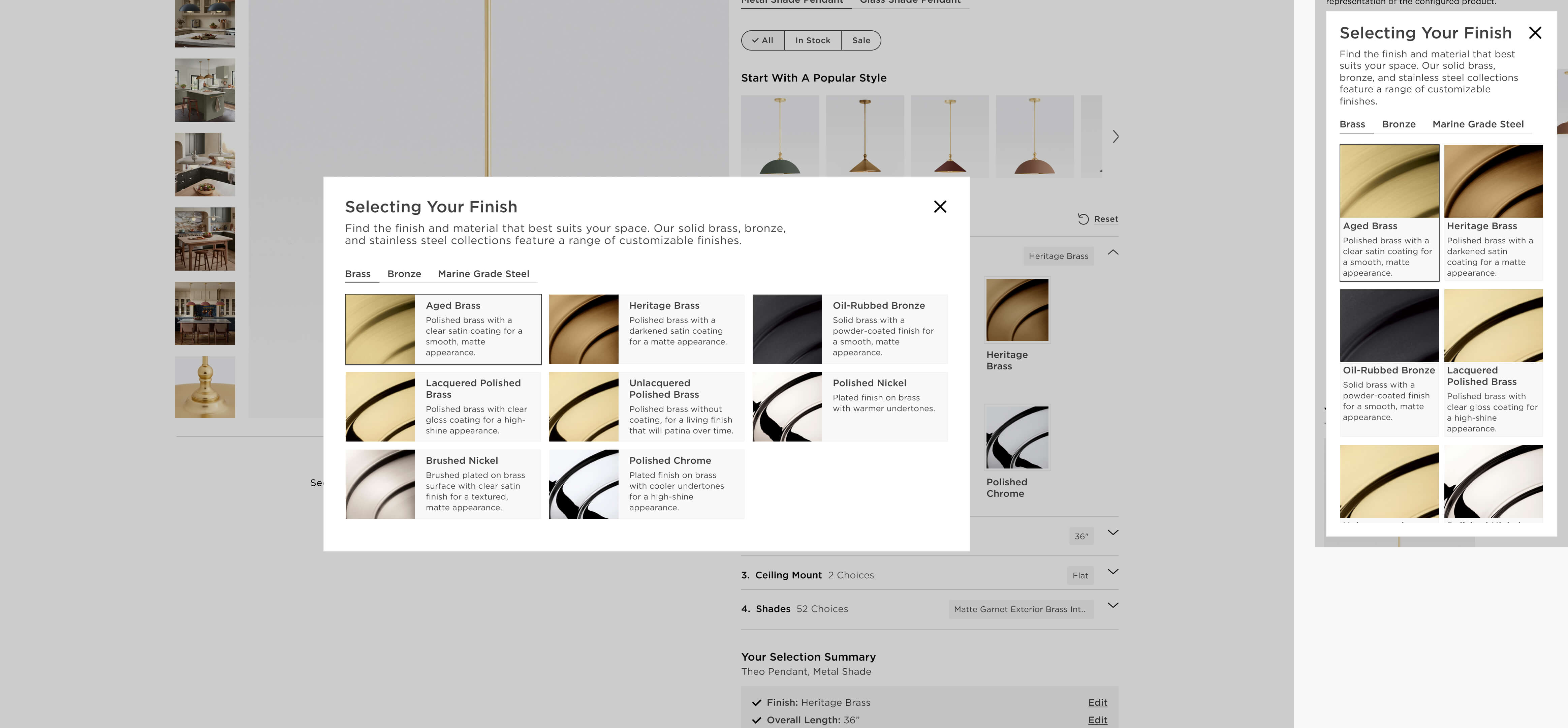
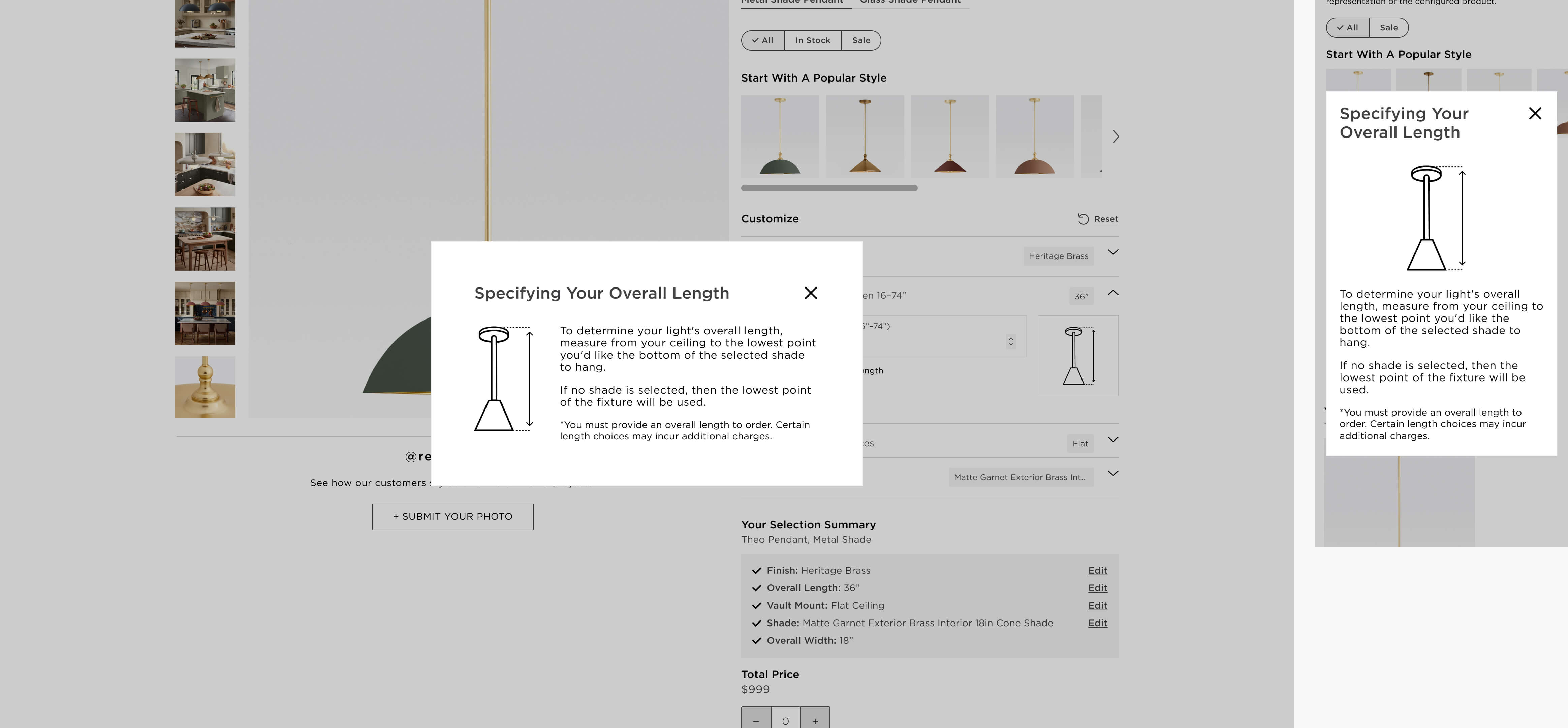
Business leaders had raised concerns about customer pain points, while the site team also saw opportunities to improve clarity, reduce friction, and bring the page into a more contemporary, sophisticated state.
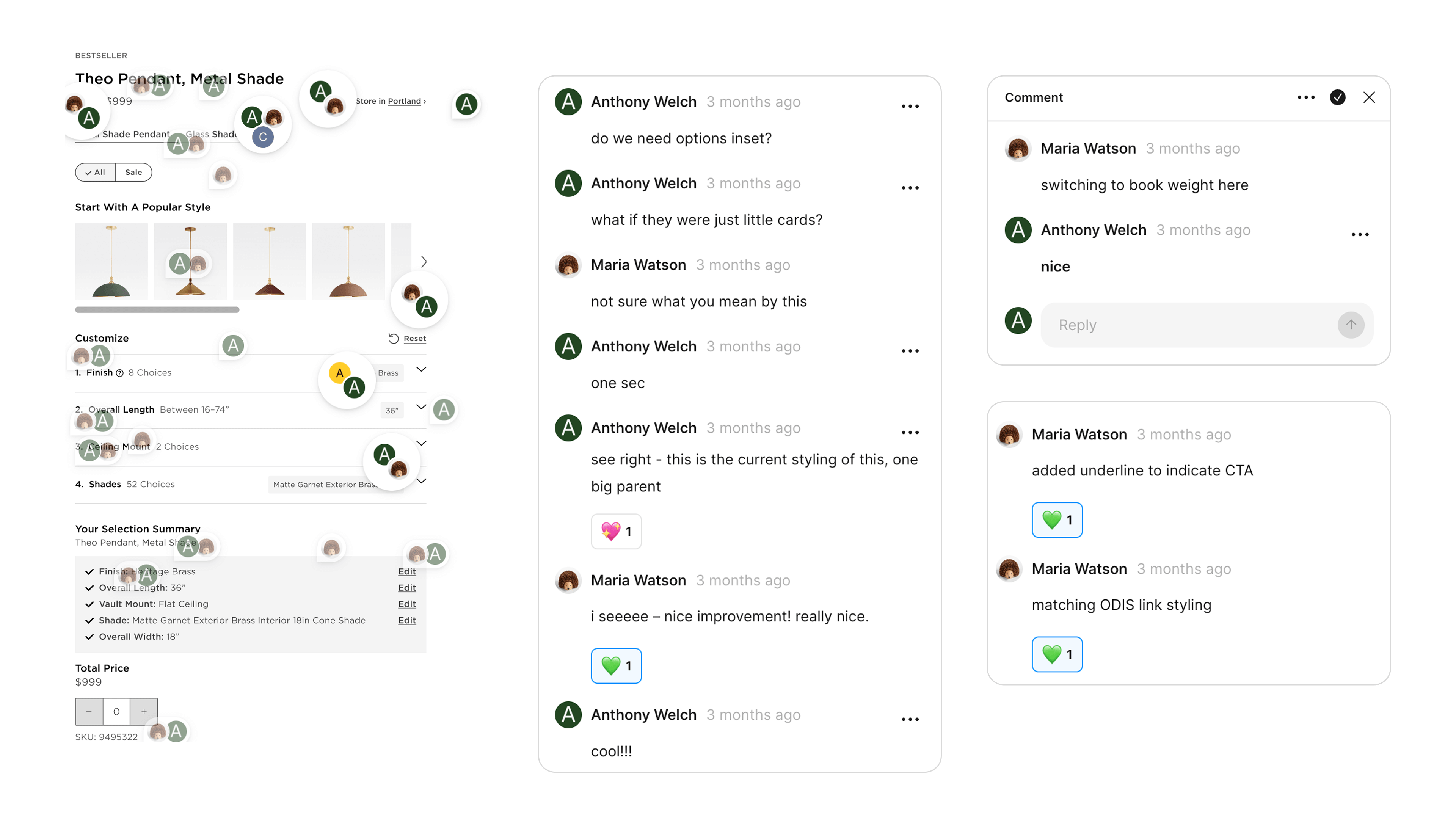
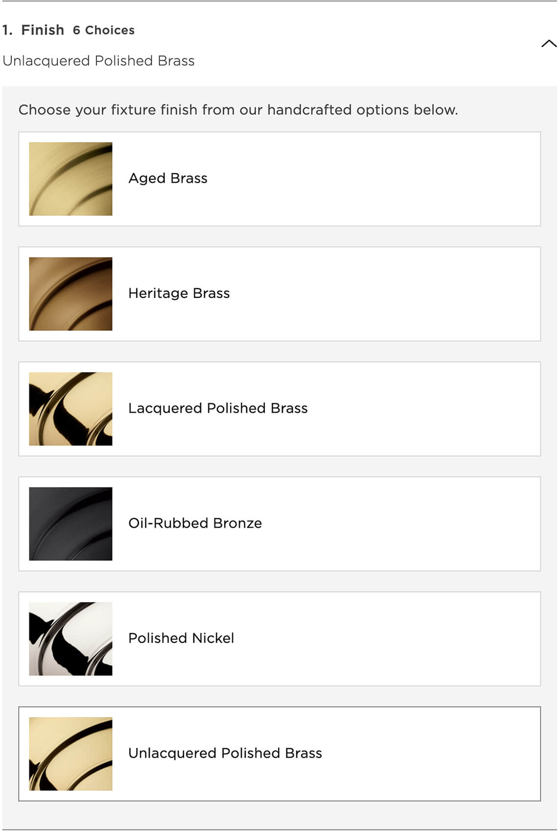
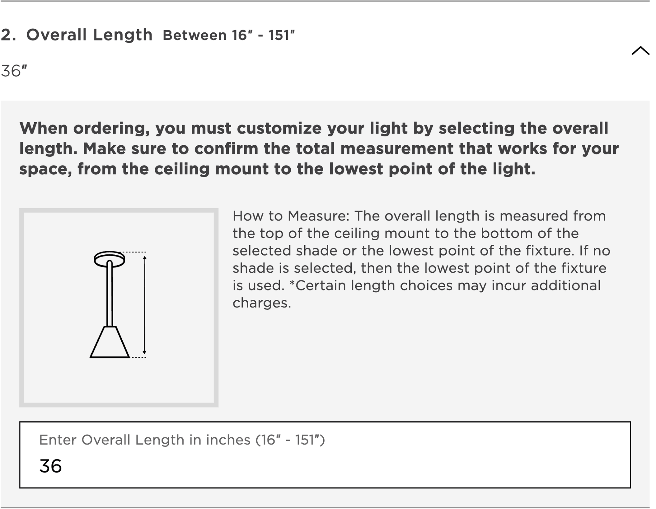
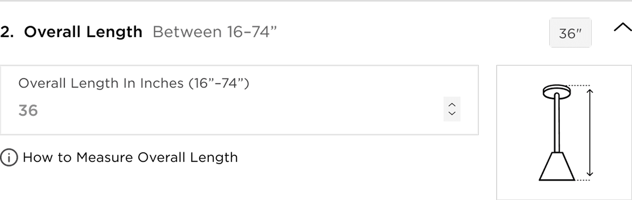
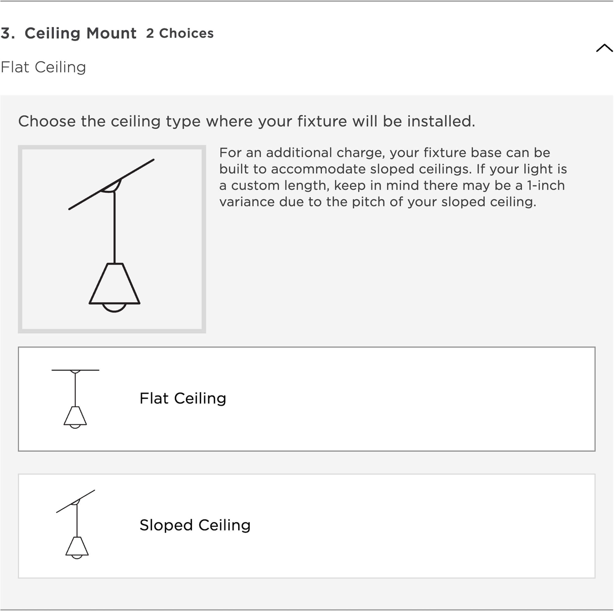
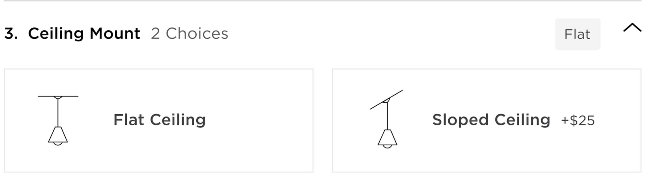
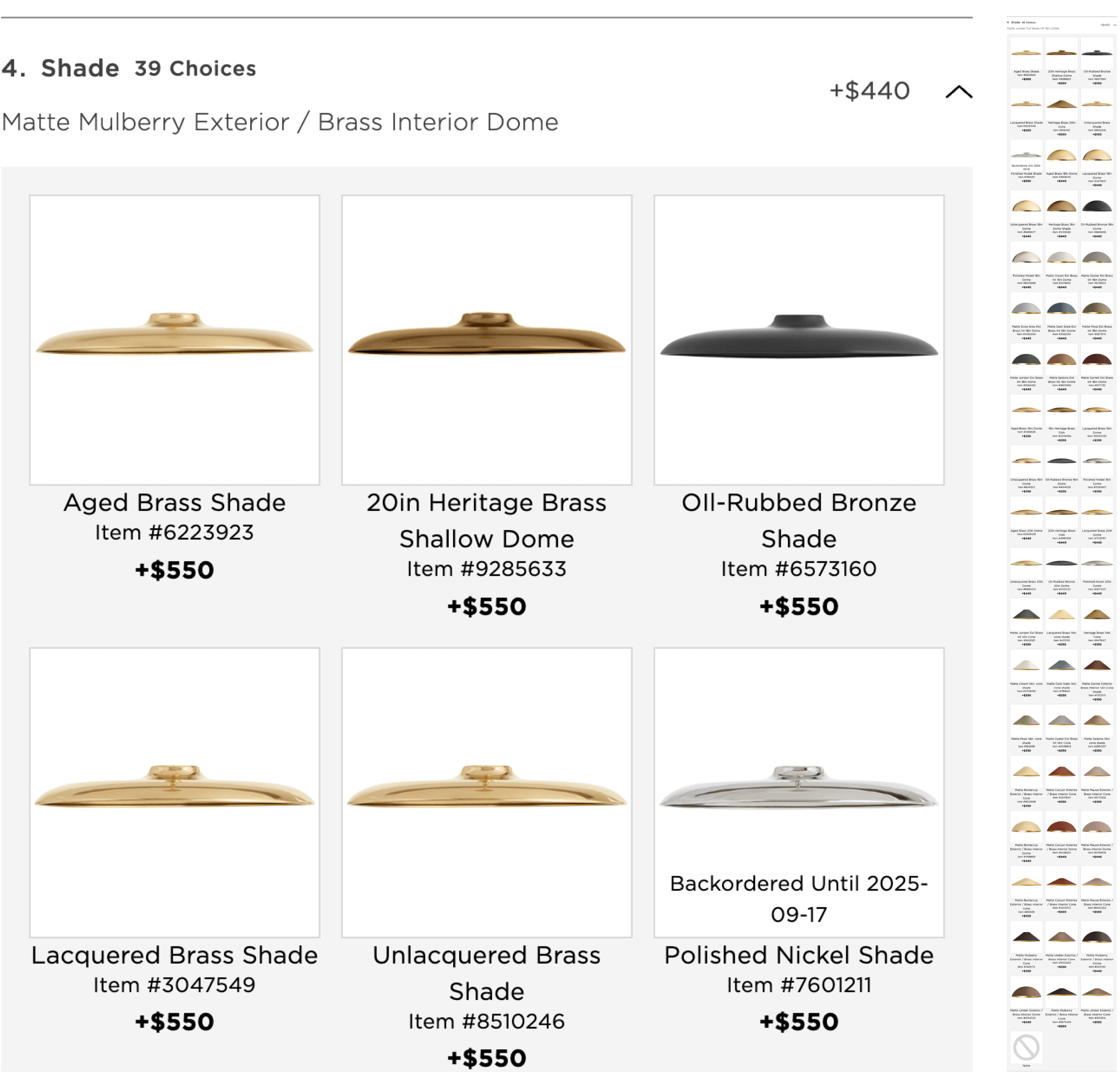
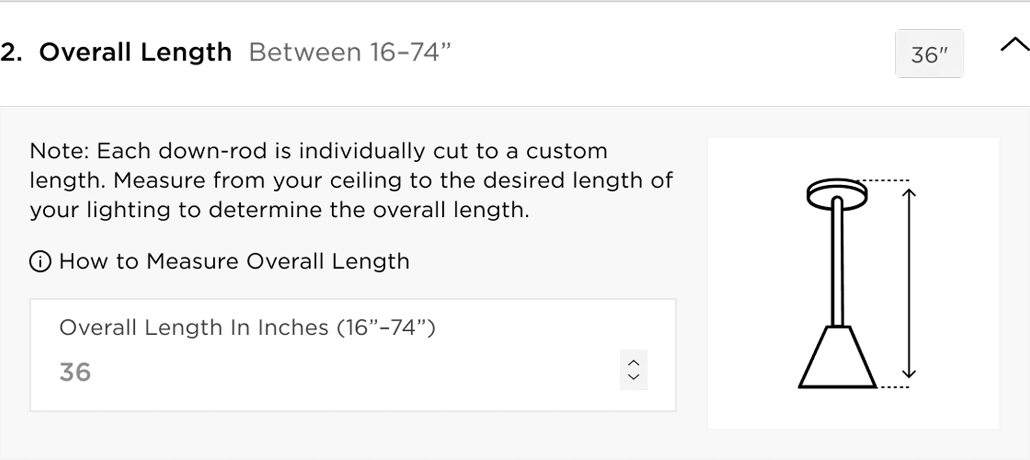
Working alongside my senior designer, Maria, who led the initiative, I contributed heavily to the Buy Box 2.0 Redesign, from early design work through launch. My role included developing and iterating on interaction patterns, proposing and refining simplifications to complex steps, and assisting in shaping visual clarity with condensed instructions, and a restructured information hierarchy.
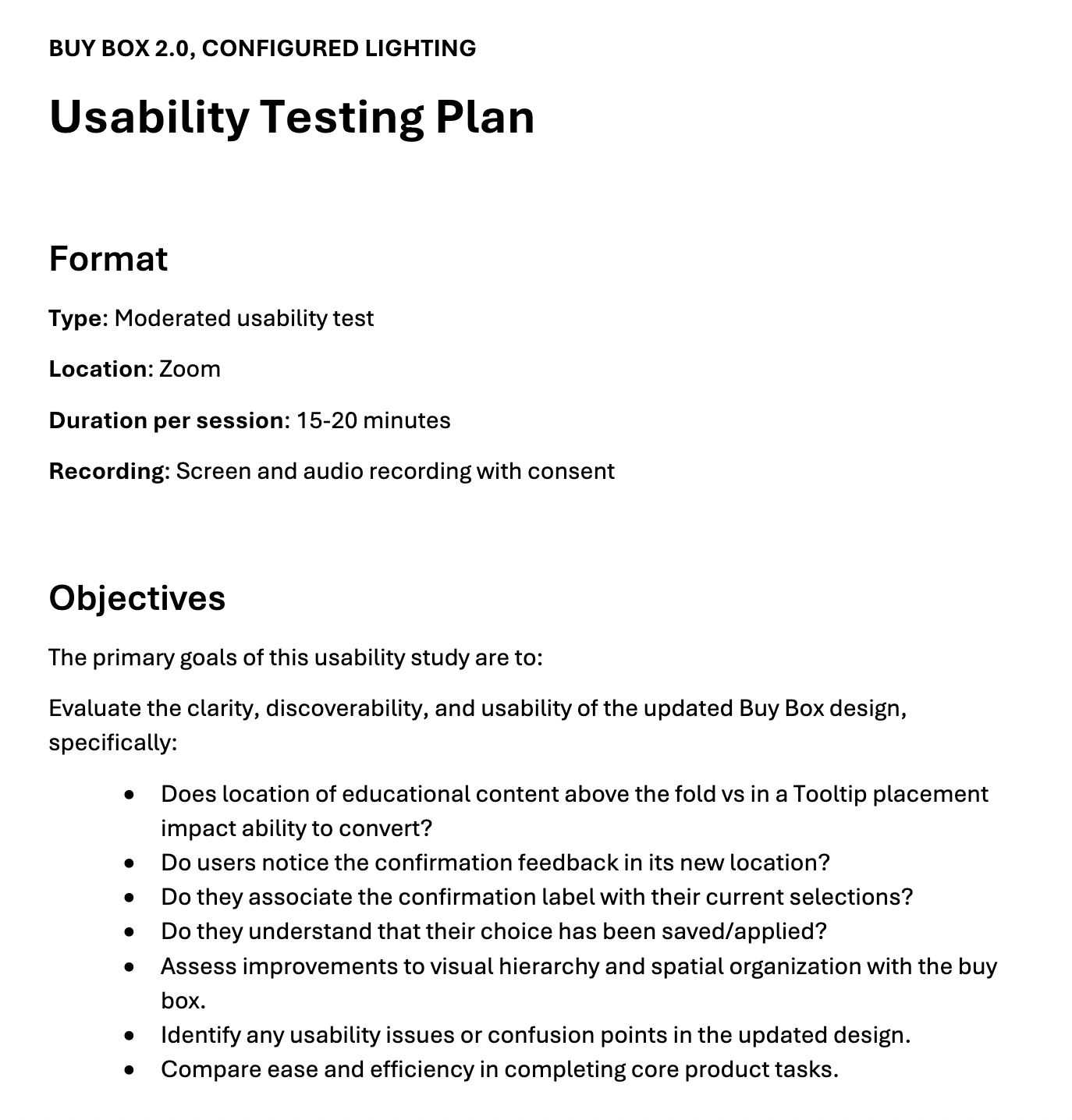
I helped push key changes through multiple leadership reviews, prepared prototypes for usability testing, and implemented refinements based on feedback. This work modernized the page while making it easier for customers to configure with confidence and move smoothly toward purchase.