Rejuvenation

Web & Brand Design

Case Study

Figma

Influencer Program Rebrand

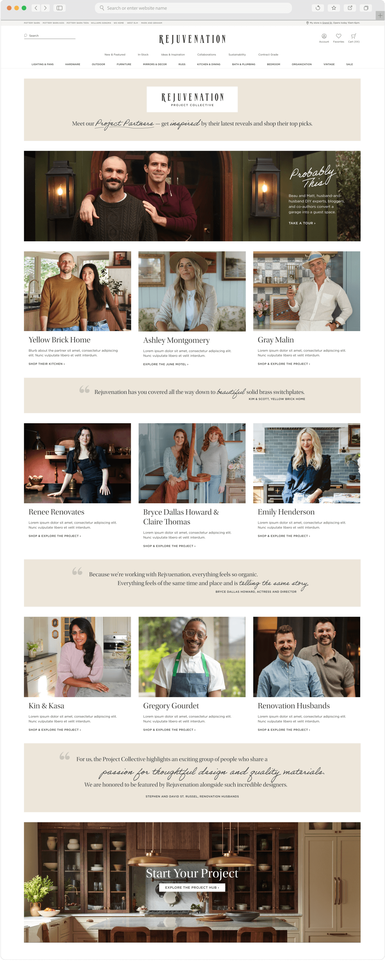
Project Collective is Rejuvenation’s influencer partnership program, spotlighting the creative voices who bring our products to life in real spaces.
I performed creative work for the rebrand of Project Collective’s landing and partner pages, working closely with my partners.
Collaborators:
Negina, senior PR manager; Maria, senior designer; Stephanie, creative services manager; Nicole, copywriter; and developers Sidney and Regelyn.

Project Intro

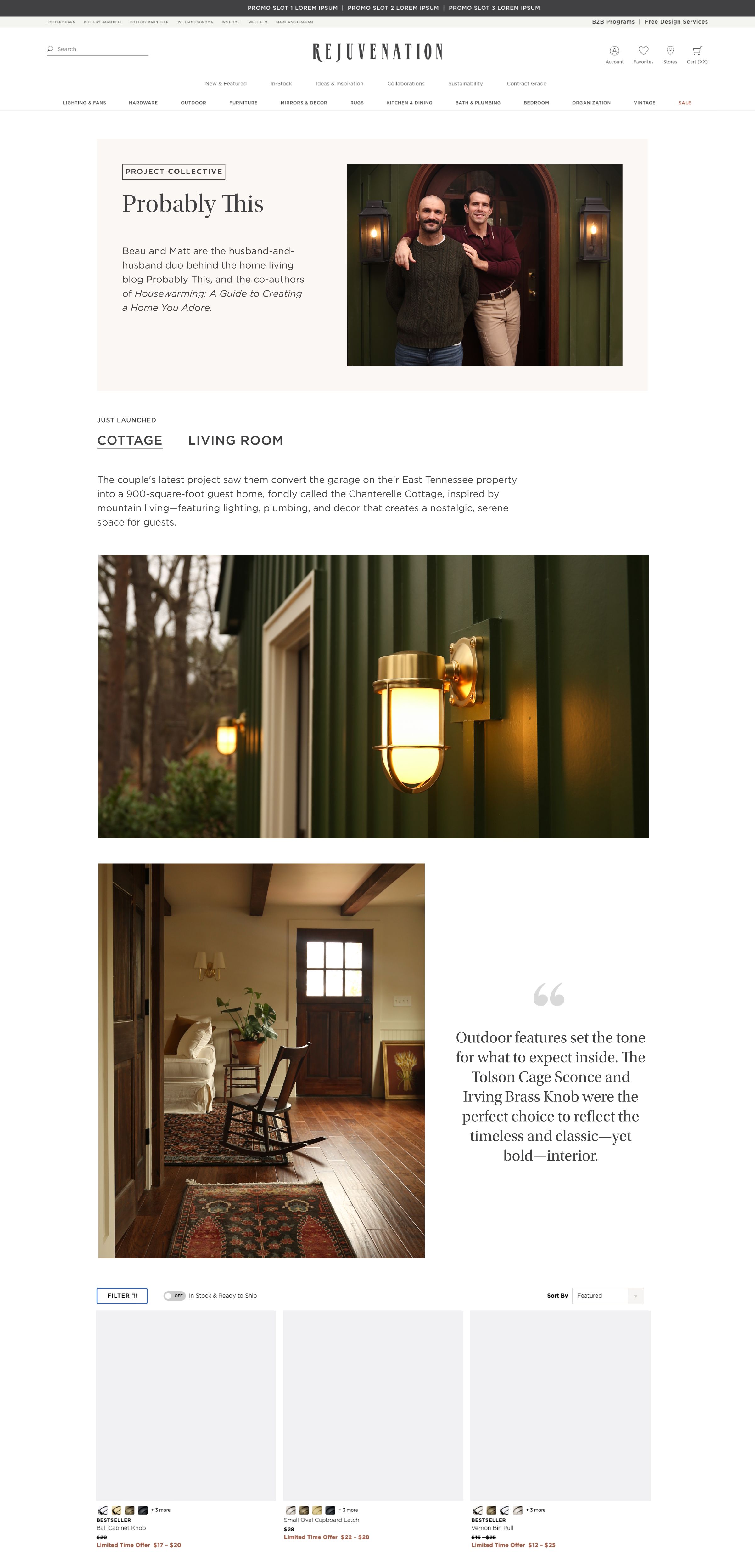
This project came from a functional request: to allow for multiple featured projects per partner. I introduced tabbed navigation to solve this in a way that fit the current site style.
Original Project Collective page
Round One: Style-consistent page with tabbed navigation
In our review meeting, it became clear the team was interested in going further.
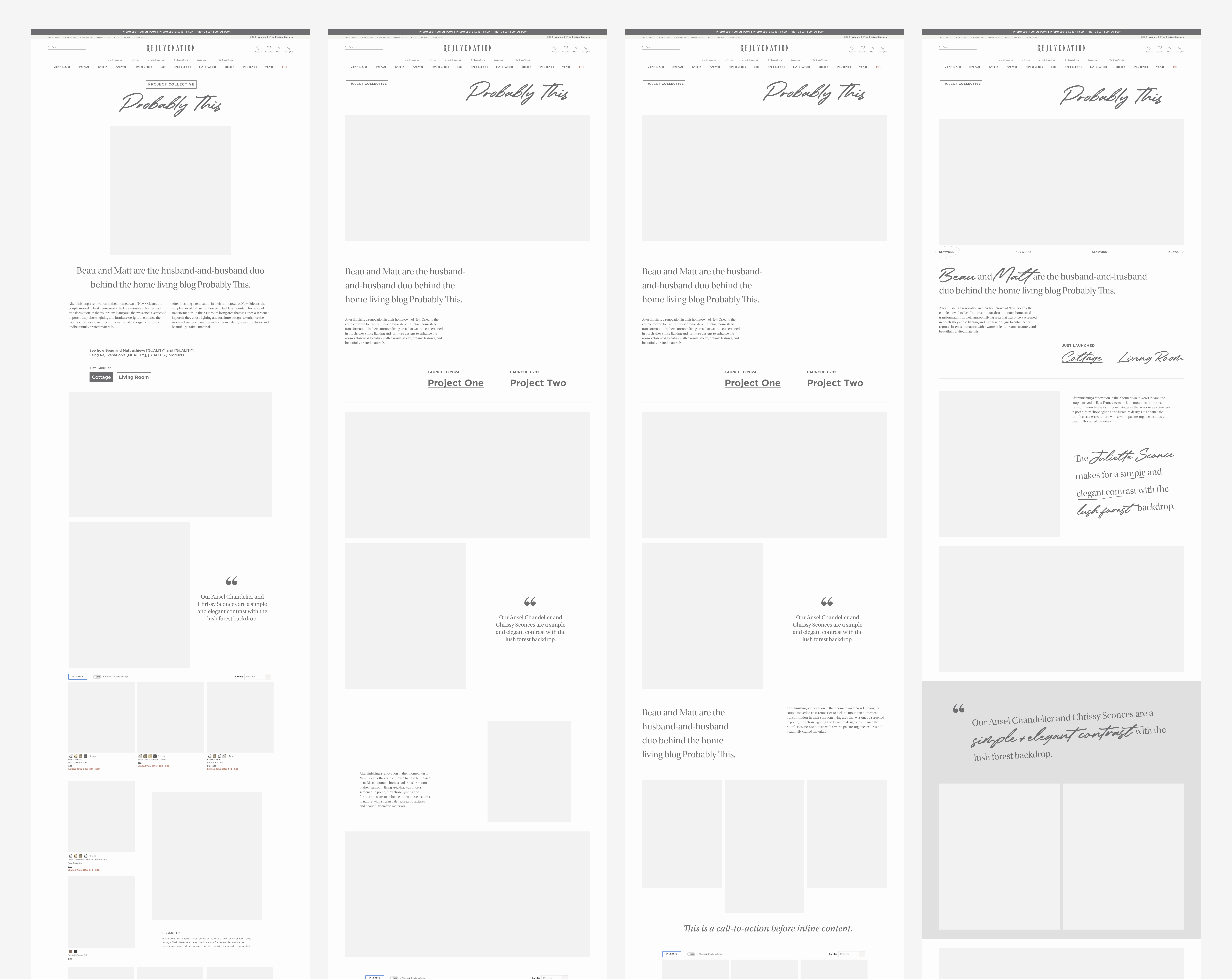
Anticipating this additional appetite, I had already created exploratory moodboards and wireframes.
I had been inspired by Heatwood, a script that was previously used in Project Collective but that needed removed due to licensing concerns. I wanted to use a handwritten style in combination with editorial elements to represent a creator's notes and inspiration.
This technique could give users the feeling of a glimpse into the process of an interior design project, or make them feel as though they were a part of the collective themselves.
Moodboards
Wireframes

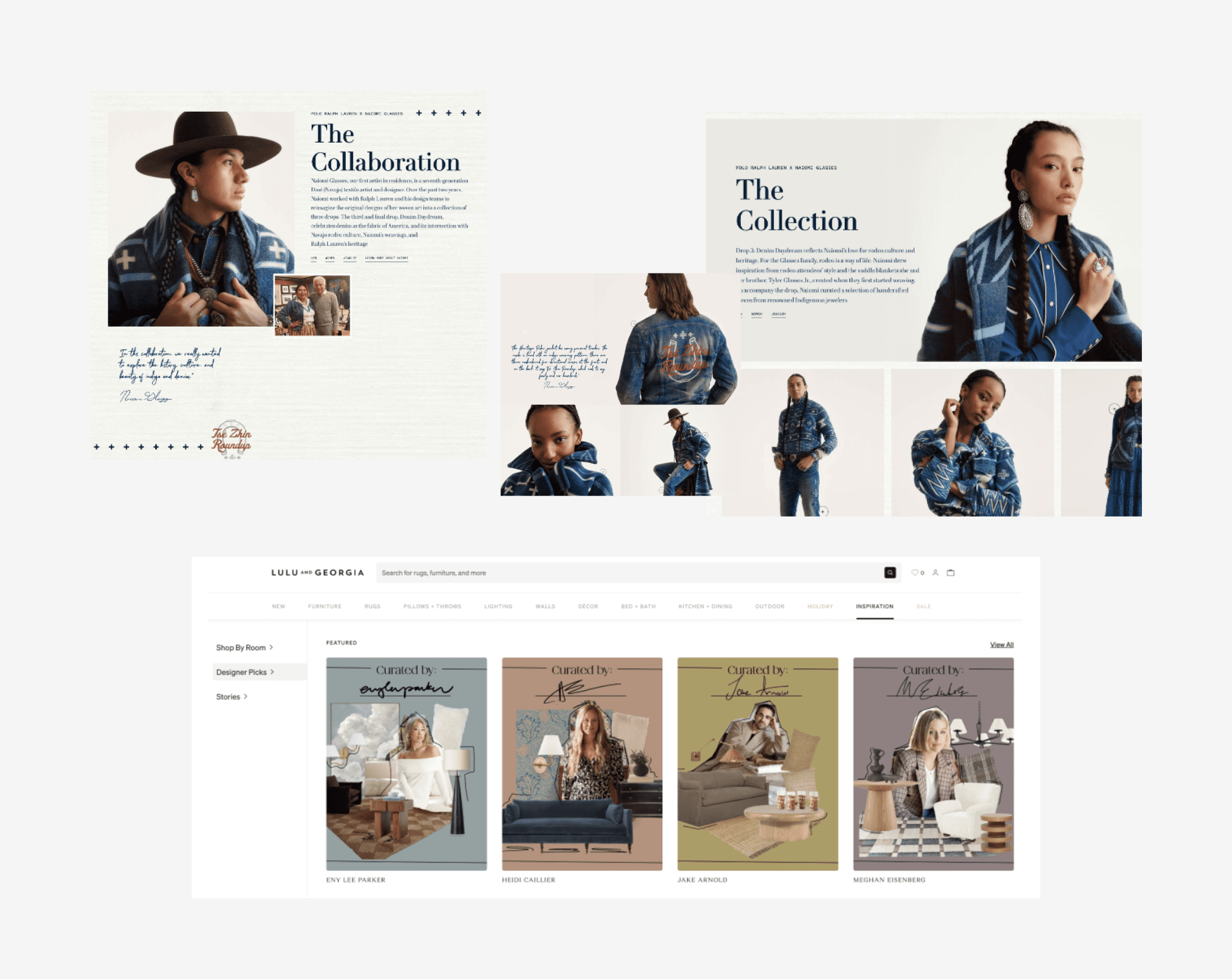
Competitive Analysis

Negina, Maria, and I researched competitor experiences and were encouraged by the human-first designs presented by Lulu and Georgia and Ralph Lauren.

Design Exploration

The team were all drawn to different pieces of the moodboards, and were supportive of the wireframes, as well. They gave me the green light to continue further down this path, expanding the project's scope from a minor enhancement to a full visual and experiential rebrand.
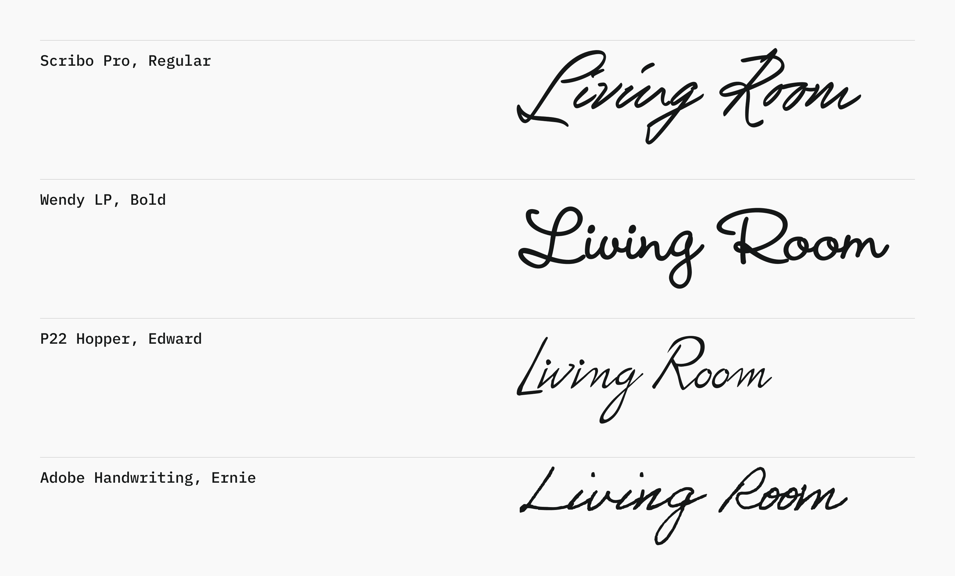
I reviewed Adobe Fonts fo find a suitable replacement for Heatwood, and made a list to review with Maria, my senior. P22 and Adobe Handwriting were clear winners, and we decided to continue with Adobe Handwriting, Ernie, for its messy yet neutral quality.
Over the course of the review process, we made changes in response to leadership feedback. We added more images to the grid to increase shoppability, tightened up whitespace where we could, and set elements on angles back to straight lines.
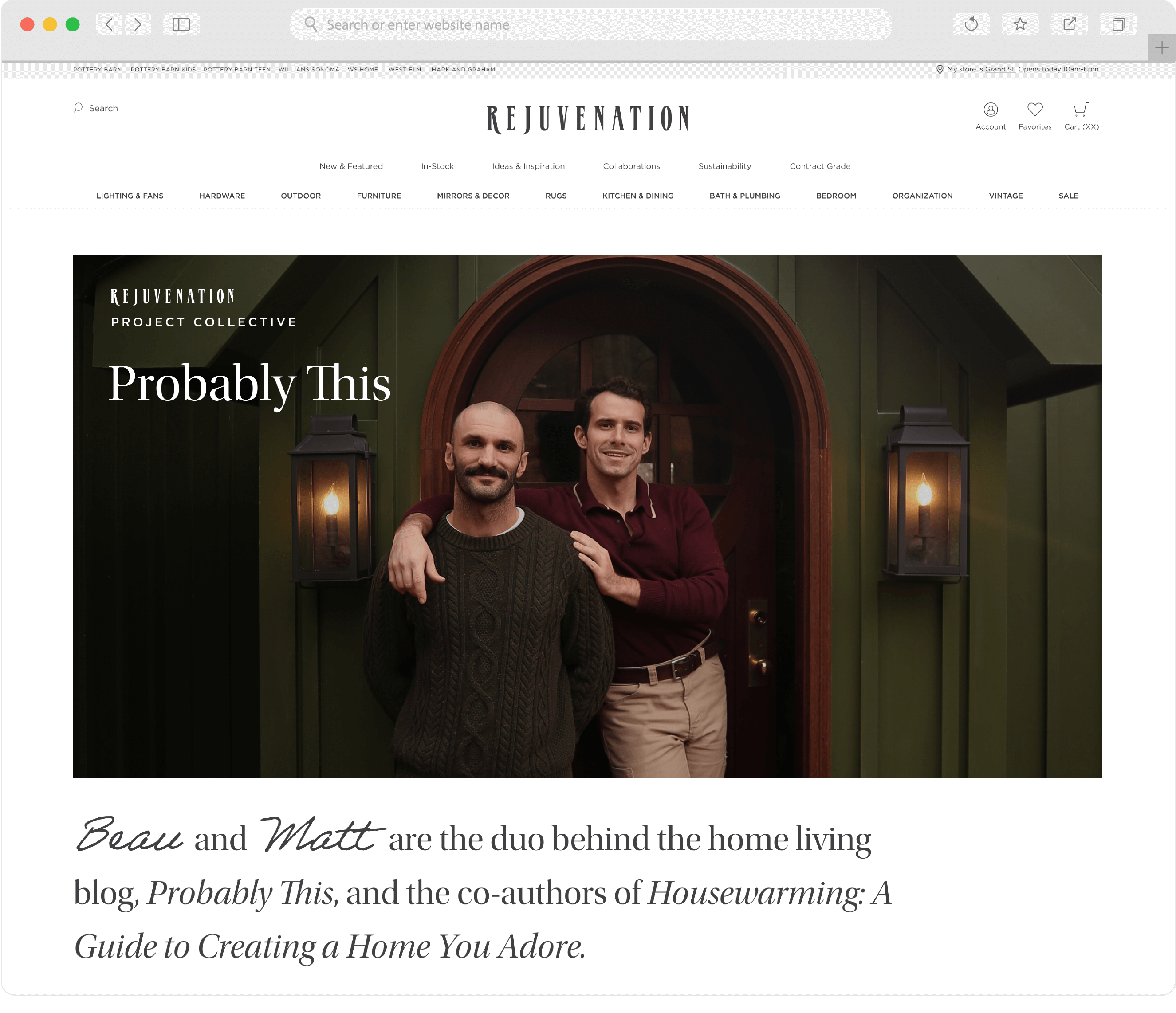
Final, Desktop
Final, Mobile

Project Strategy

by Negina Pirzad
The final concept brought a new layer of storytelling to the site, aligning with two key brand goals, explained best by Negina:

Brand Alignment

Connect Project Collective more directly with our brand pillar, Project Authority, by highlighting the expertise of each collaborator.

Community of Industry Experts

Enhance visibility of unique community of design and DIY tastemakers.
Tactics: Letting personalities shine on Hub page and landing page–tighter headshots, commentary 
via quotes, and partner bios

Creative, Handcrafted Design

Incorporate visual cues from designer moodboards  this in true craftsmanship to spotlight the work behind the reveal, inspire
Tactics: Bold, design-forward elements in font size and style variations, handwritten quotes, full project reveal image album.

Brand Voice

Insert brand recognition in key area within project flow.
Tactics: Branded logo to use on owned and partner channels, project tips on landing page mirroring Project Guides, 'Start Your Project' footer 
on Hub page

Conversion

Encourage deeper exploration and shopping.

Stay A While

Our goal is for the dynamic page presentation to inspire longer browsing, as measured by bounce rate
Hub Page by Maria Watson
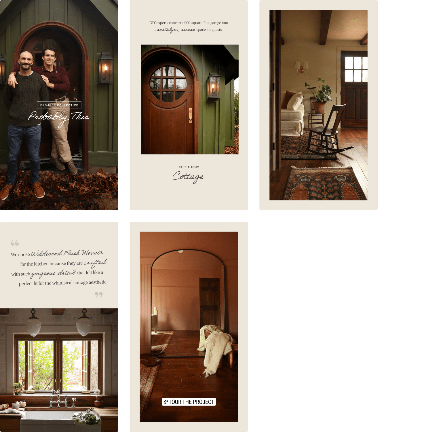
Social Assets by Lex Bianchi

Final Solution

Explore these pages yourself on the live site!

Let's Work Together

I’m a visual designer from Wisconsin. I have spent the last six years dialing up brands' reach and personality through clever but practical design.

Learn more about me here.

Portfolio 2024