

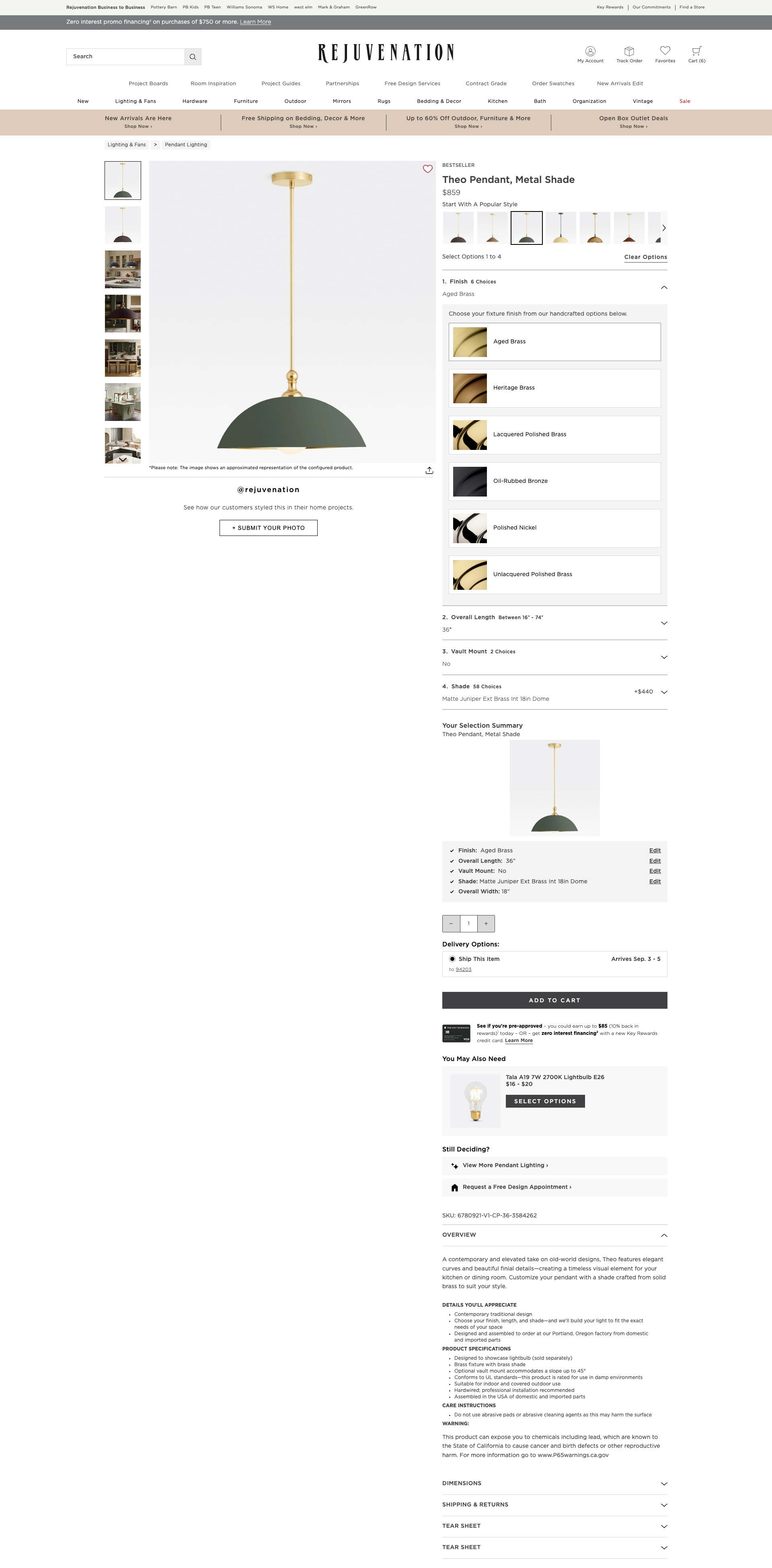
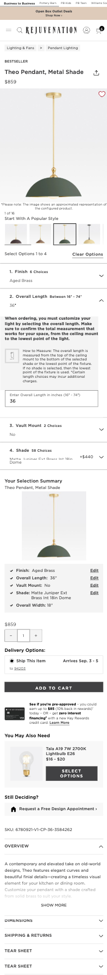
At Rejuvenation, the Buy Box is a key part of the product detail page—where customers configure, price, and purchase customizable products like lighting. Over time, it had become dense with duplicative instructions, inconsistent styles, and unclear hierarchy.
Business and site teams identified pain points and opportunities to improve clarity, reduce friction, and modernize the experience.
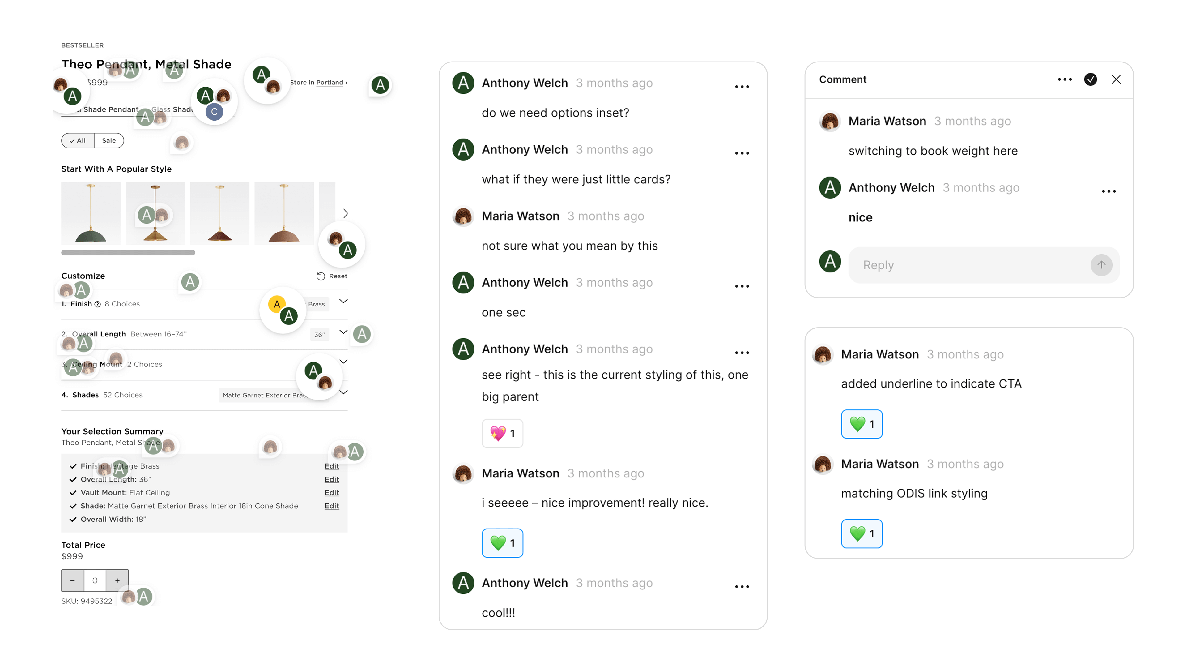
Partnering closely with Senior Designer Maria (project lead), I played a central role in shaping the Buy Box 2.0 redesign from early exploration through launch.
I simplified complex configuration flows, and refined the visual design to improve clarity and usability. I also prepared prototypes, conducted usability tests, and integrated feedback for leadership reviews. The redesign improved clarity, legibility, and user confidence while aligning the page with a more sophisticated brand aesthetic.
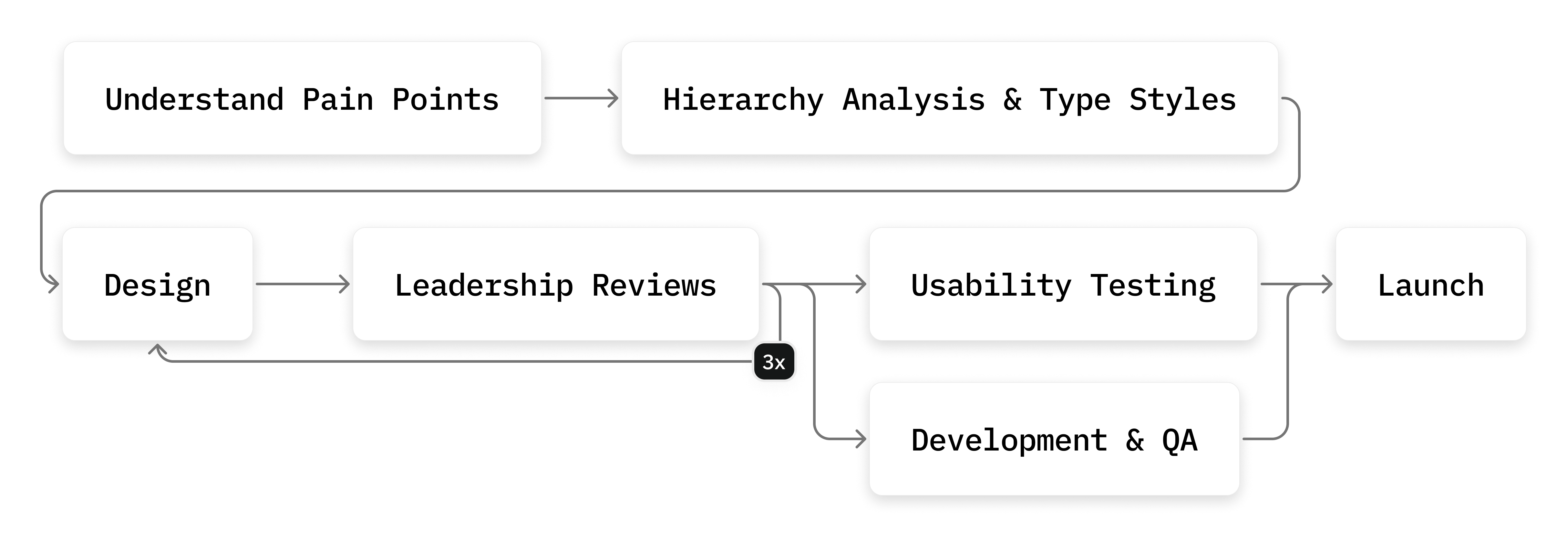
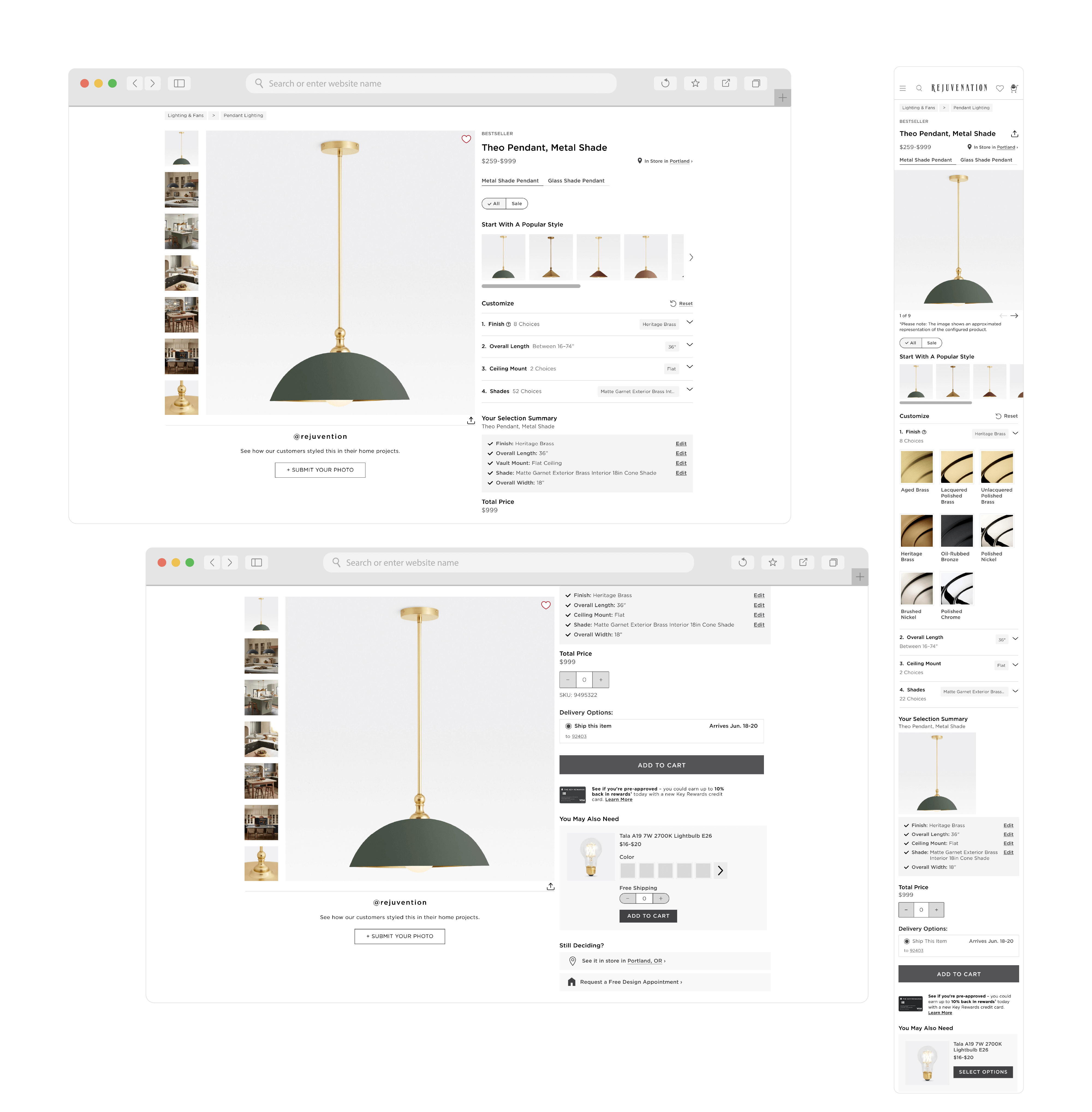
The project moved quickly—just two weeks to design and present a full redesign. Implementation took three months and involved identifying edge cases in lighting configurations and partnering with site management on QA.
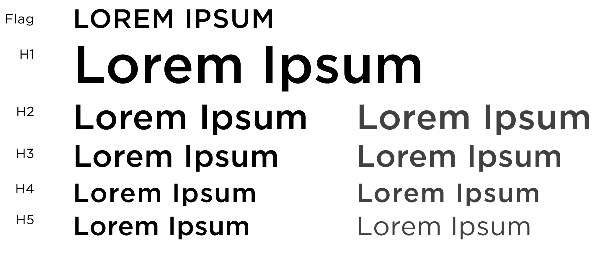
Maria redefined the page’s type system, simplifying and clarifying hierarchy. Shifting headings from dark grey to black and limiting all caps improved legibility. This alone made a significant impact on the page’s overall polish.

I collected various references from competitors to stay grounded and defend decisions as we considered new solutions.

We evaluated every Buy Box element, from dropdowns to microinteractions, through hundreds of small, decisive refinements.
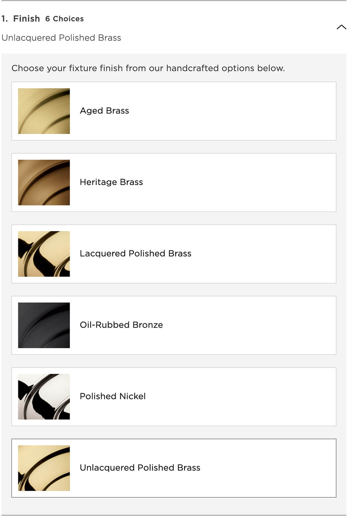
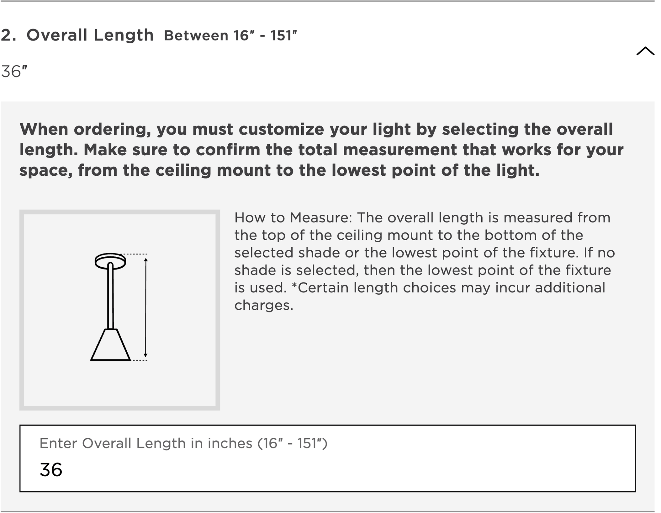
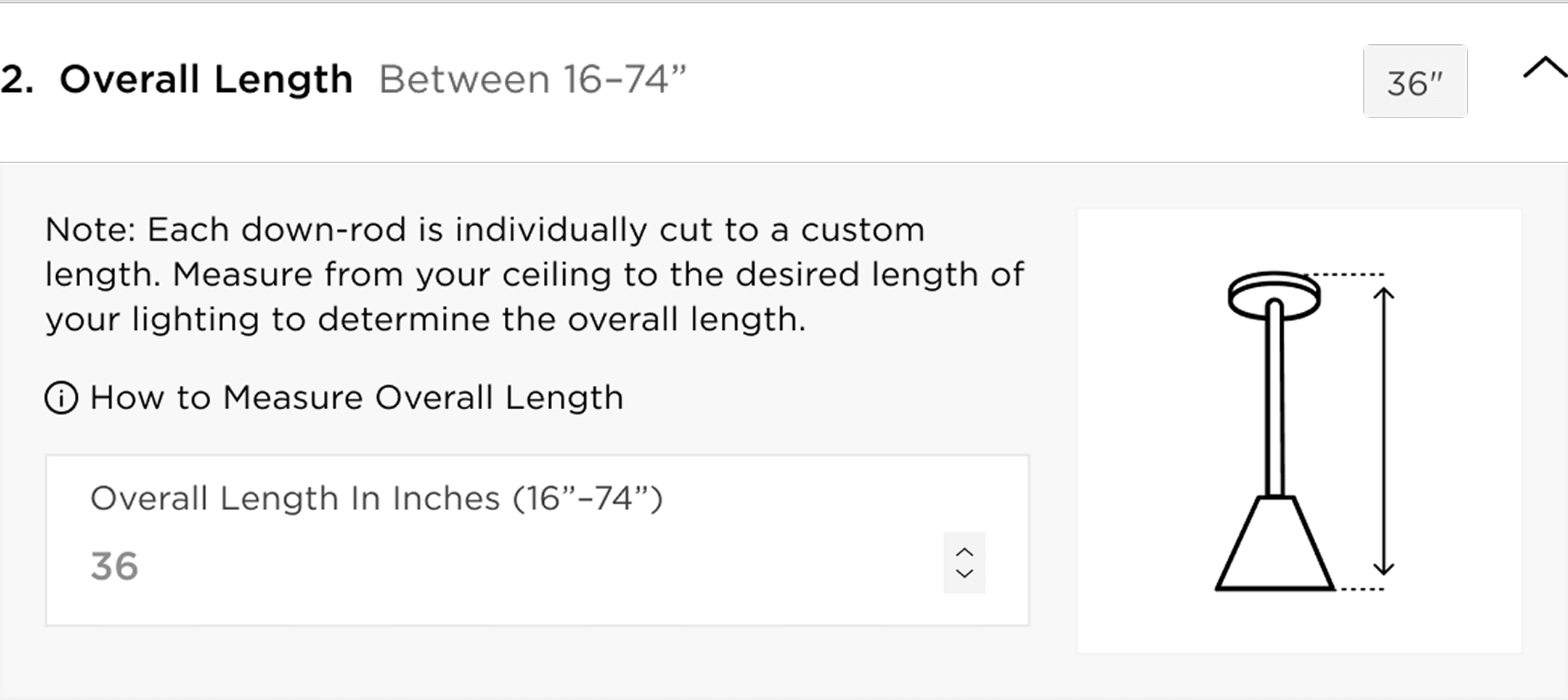
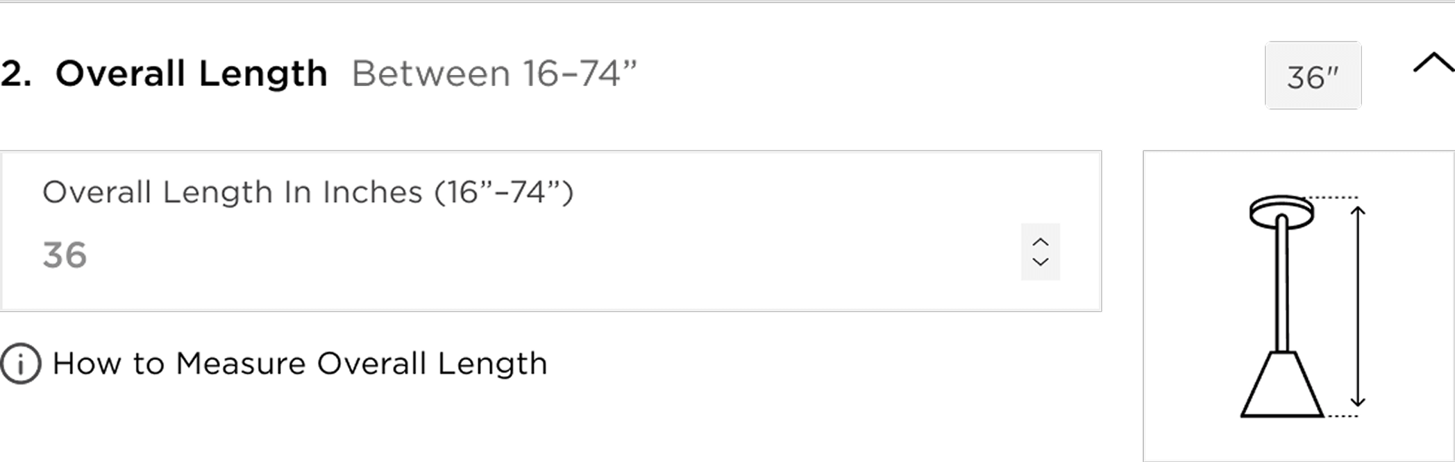
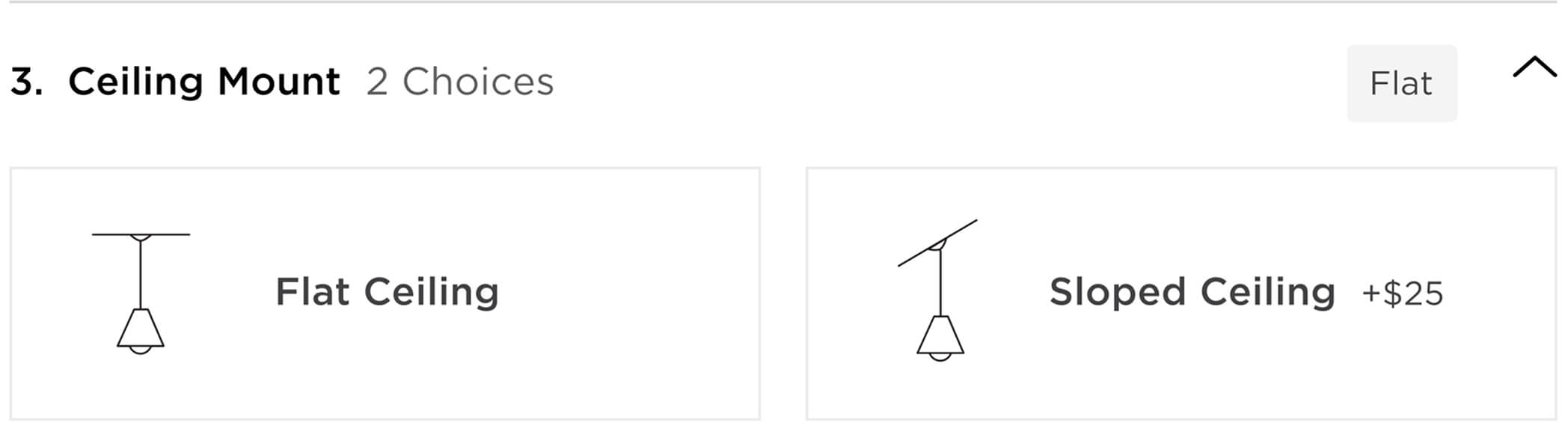
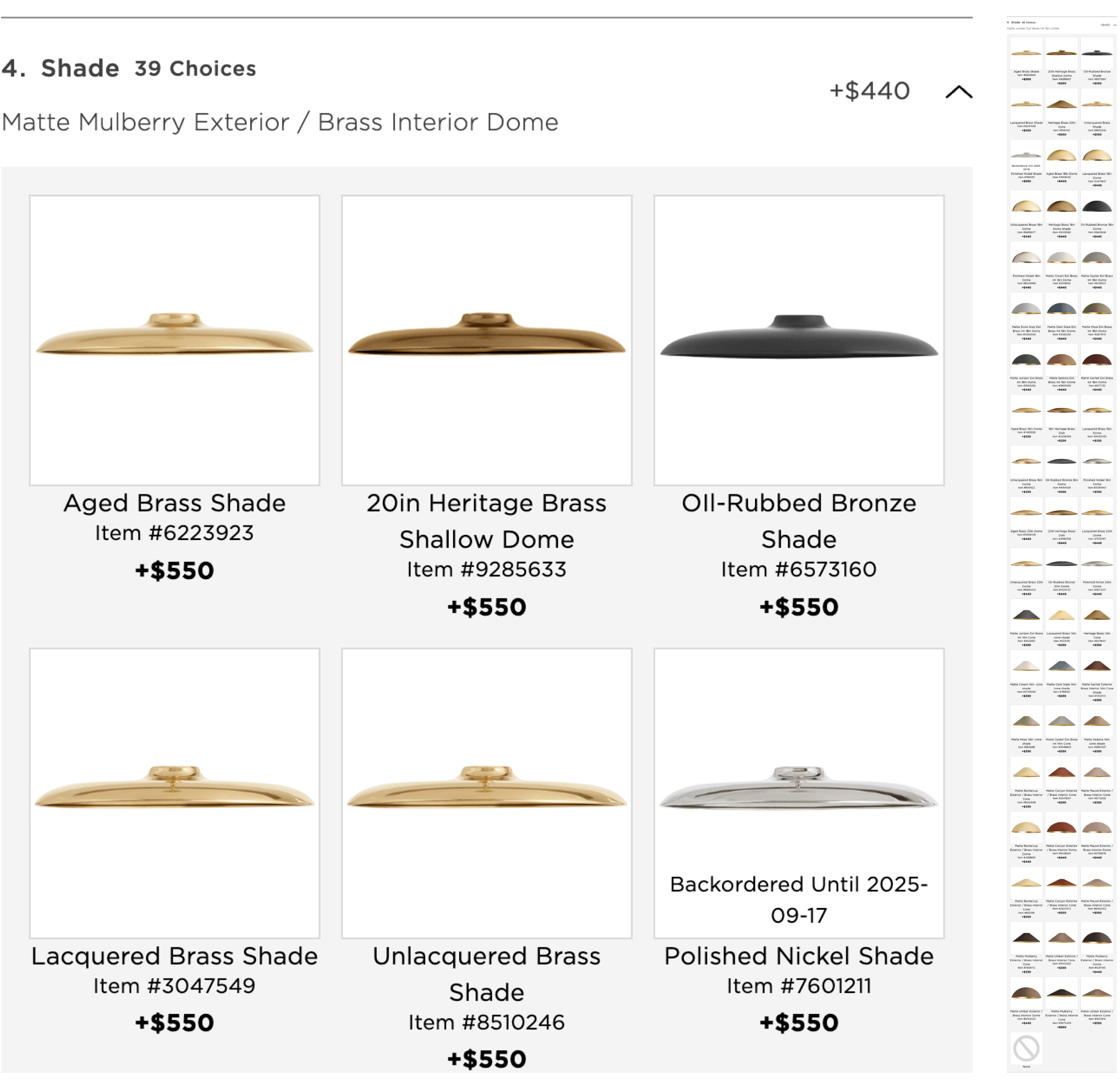
I iterated on the selection dropdowns to reduce cognitive load and improve scanability. Working with Maria and incorporating feedback from business partners, we reduced unnecessary copy, reorganized options for clarity, and significantly shortened components like the Ceiling Mount menu and Shade Tray.
I led early iterations on the selection dropdowns to reduce cognitive load and improve scanability. Working with Maria and incorporating feedback from business partners, we reduced unnecessary copy, reorganized options for clarity, and significantly shortened components like the Ceiling Mount menu and Shade Tray.


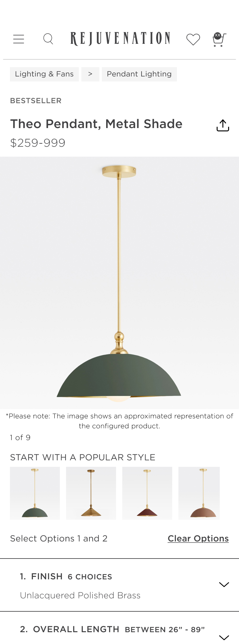
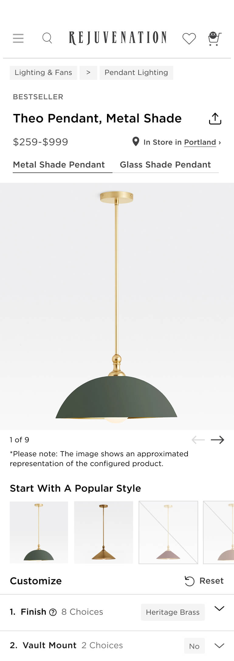
We touched every part of the Buy Box across desktop and mobile: crosslinks, filters, names, prices, delivery options, and more. I also explored improved image navigation patterns to make gallery controls clearer and more intuitive.

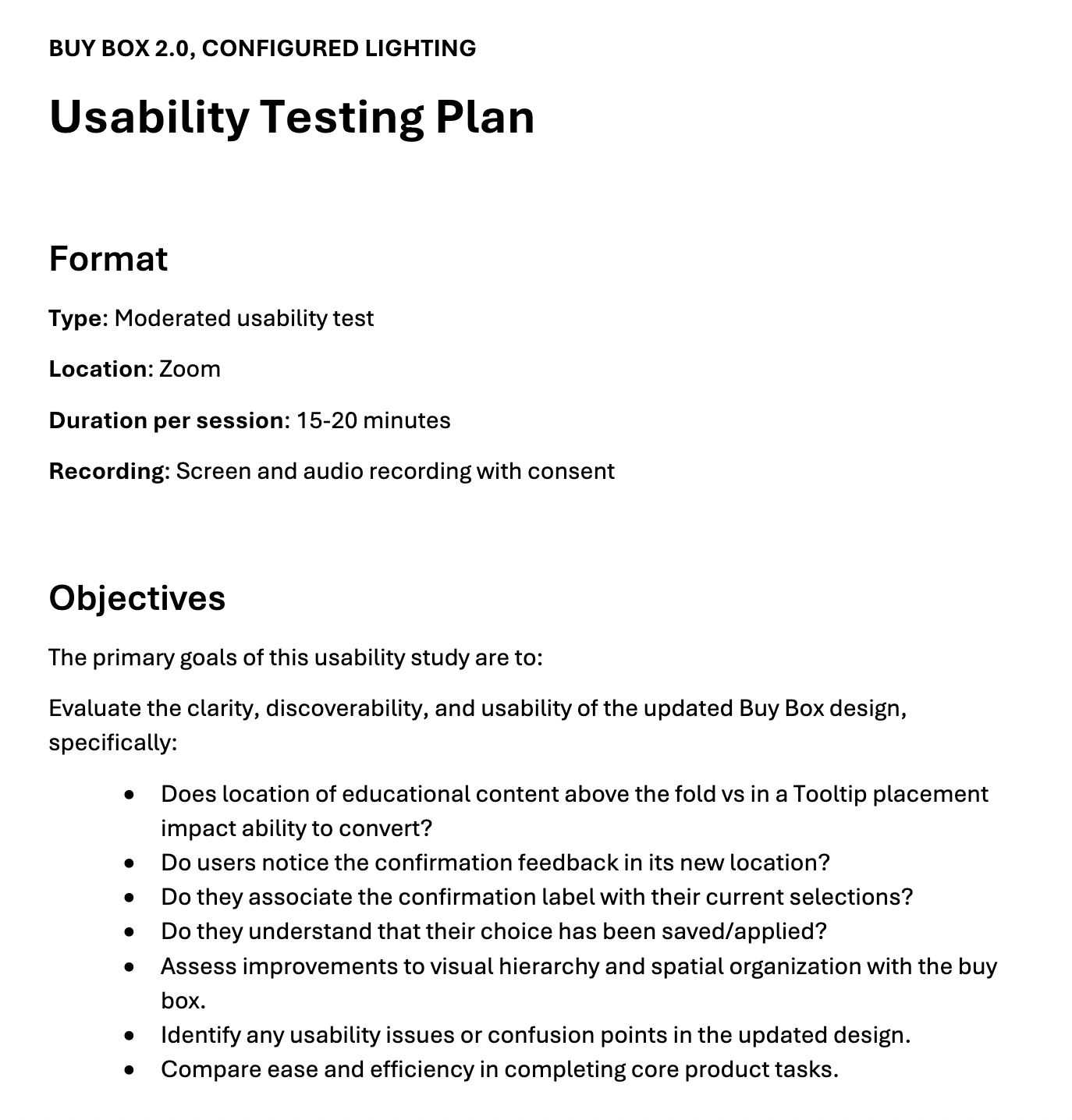
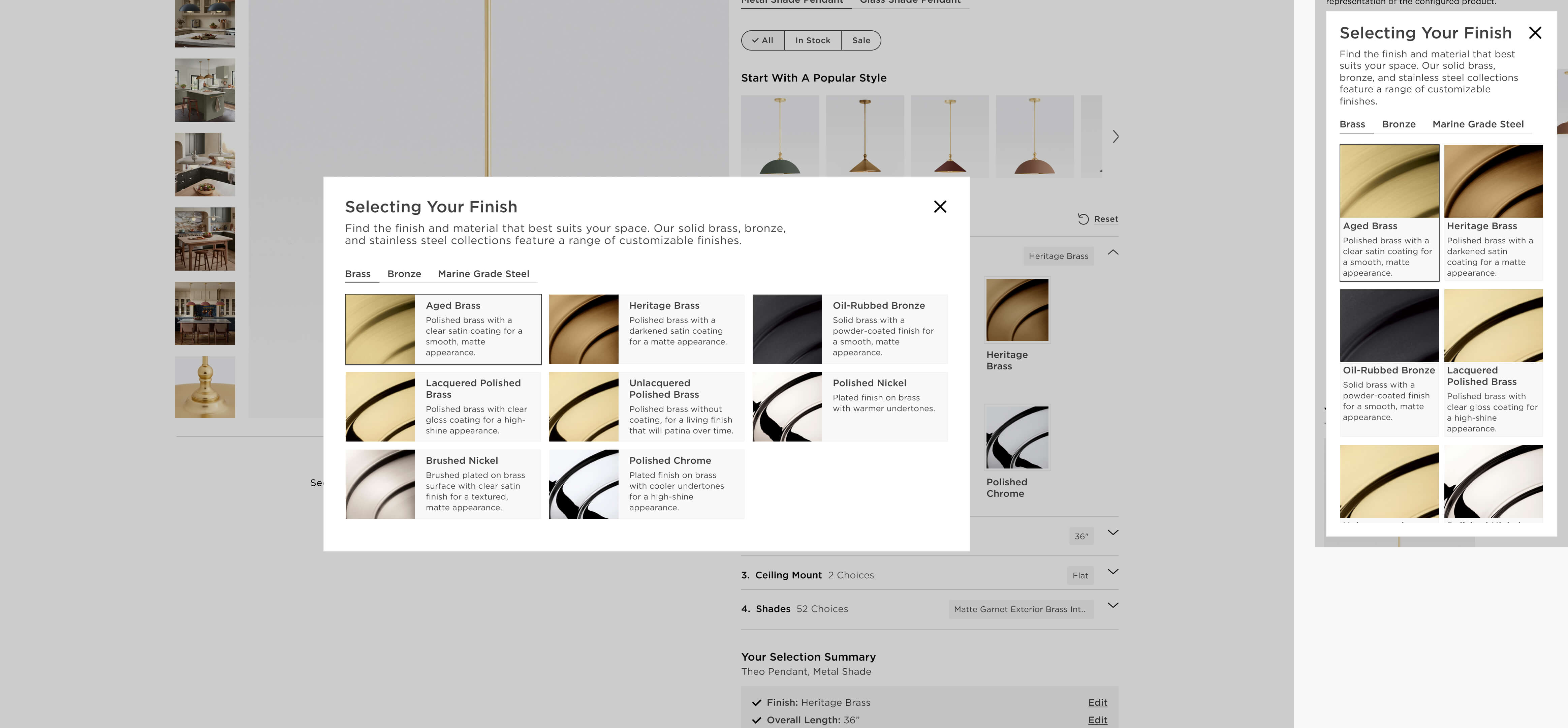
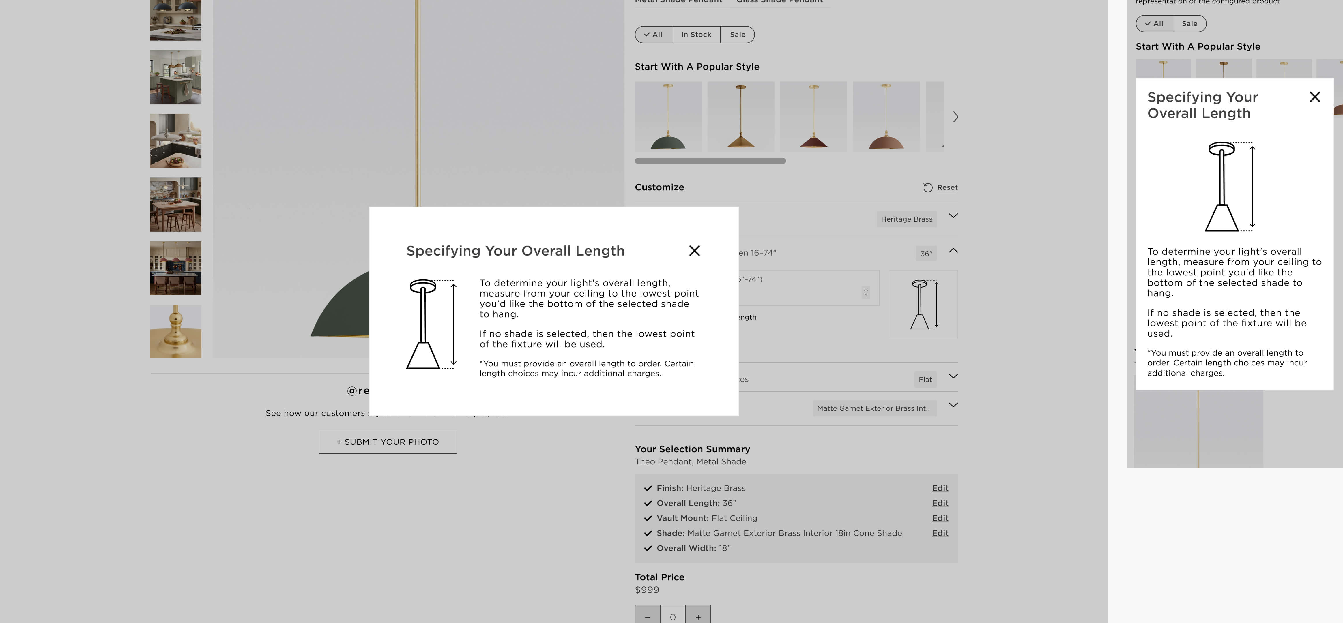
Leadership praised the redesign for its clarity and sophistication. Following executive review, I developed and ran usability tests with seven participants focused on educational copy within configuration trays.
Findings showed tooltips best balanced clarity and simplicity—users valued quick-access help over long instructional text. Our recommendation: rely on tooltip guidance while monitoring post-launch behavior.

I’m a visual designer from Wisconsin. I have spent the last six years dialing up brands' reach and personality through clever but practical design.
Learn more about me here.